This week I have been bouncing around a bit tackling a lot of the feedback I have been seeing on the forums and around the ‘internets’.
First up on the hit list, camo patterns.
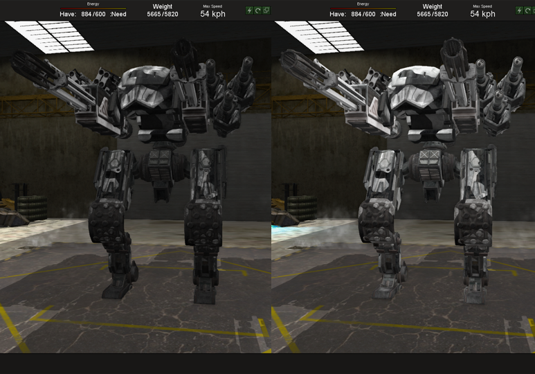
There were quite a few complaints about camo patterns being too hard to see in combat since the updated models and textures. I took some steps to help brighten some of the colors and increase the contrast. This really helps see the patterns you have applied and see them in the heat of battle.
Before / After:

In addition to this, I made some changes to the way the AI teams select camo patterns and adjusted the patterns they have available. This will prevents the issue of the AI selecting very similar colors for opposing teams.
Both of these should help greatly with identifying allies and enemies in battle.
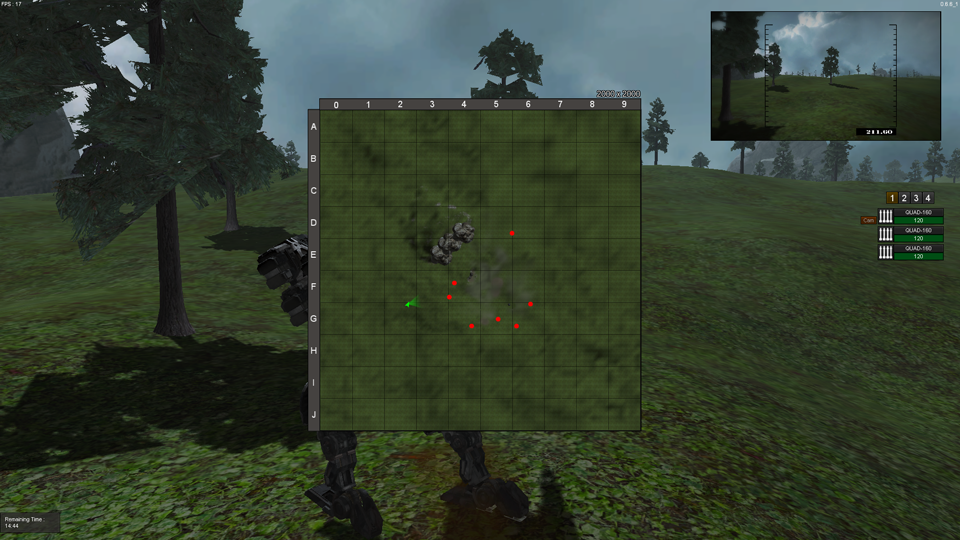
Speaking of identifying enemies in battle, I have made 1 small improvement to the map.

In the top right hand corner there is a size indicator that shows the size in meters of the total map area. Smart players will be able to use this indicator to help gauge long distance indirect fire at enemies!
In addition to these fixes, I have made some more boring but highly needed changes.
Voice chat has moved from an always on system to a push to talk system. The Push to talk button is customizable [default is left shift] and the active microphone can also be selected from the options menu.
Also making an appearance in the options menu is the ‘Eject’ key binding, which is default set to ‘Backspace’.
I am also making some changes to the way the options system works. This should eliminate the weird bug with graphics options not ‘sticking’ until you open the options menu.
One last minor thing I added is a ‘universal’ tooltip system that allows me to add tooltips to any UI element in the game. I have gone ahead and added tooltips to most of the items in the garage, but I am still looking at different places I can add them to help players along.
Well, that is all for this week! Make sure to check out this weeks weekly discussion thread and to vote in the Alienware contest for a chance to win a free computer!

Comments 2
One more thing that would help is if you rotated the Armour pieces in their preview windows- especially the Medium parts, to have a full-face view. Let you know the shapes of them before selecting them.
Also, map sizes YISSSS!
Nice updates this week, thank you!