Wow, almost didn’t make it in time this week! Well, I have been continuing to frame out the UI, completely re-thinking how players get into the game, the menu options they have, and how ‘smooth’ it is, for both new and experienced players.
Last week I showed you the new main menu [which has already changed some!] and this week I have done both the server browser and started on the player profile.
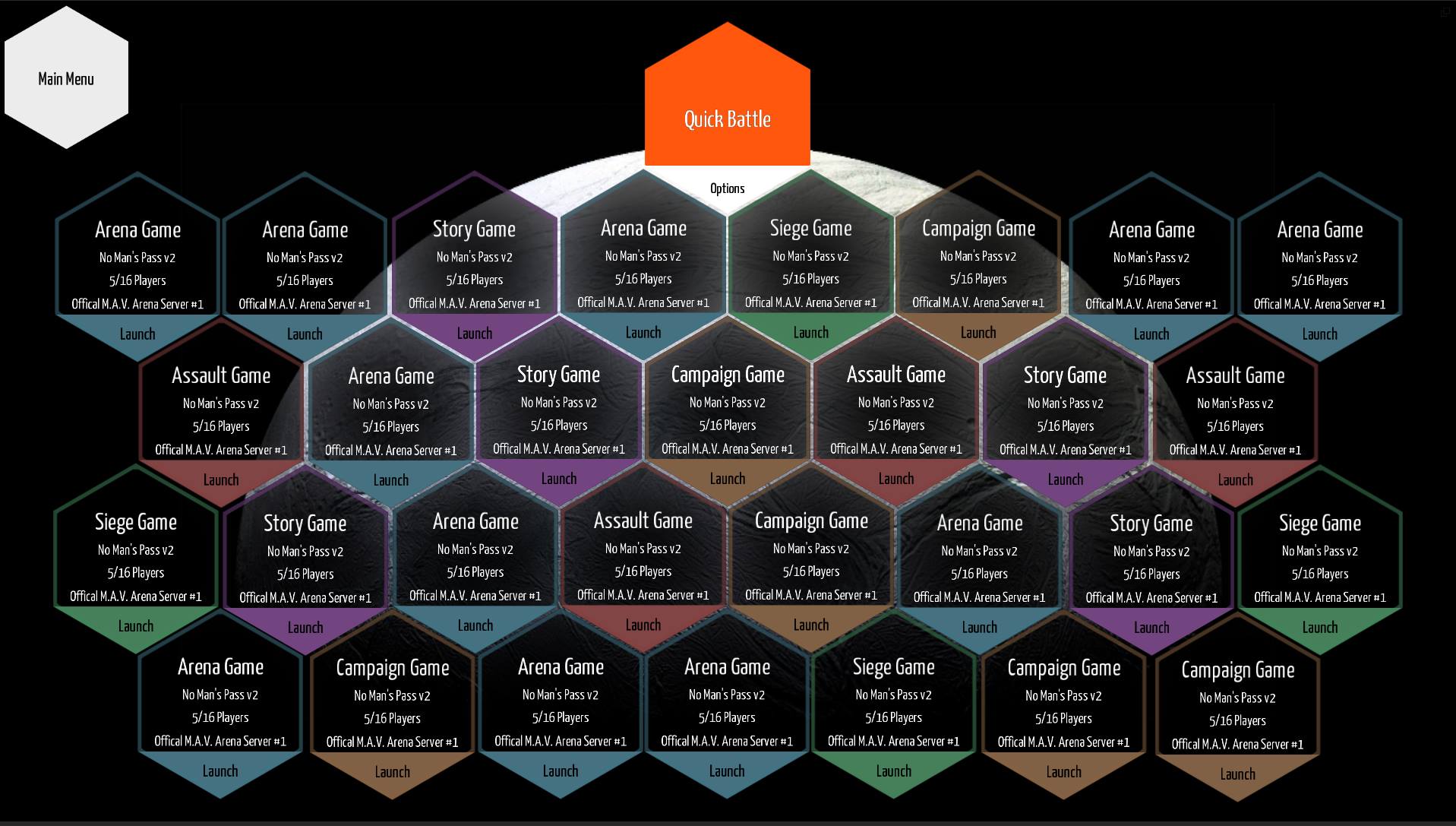
I was challenged to create a browser that was NOT just a scroll-able list. I wanted to create something unique, but that would still convey all the information you get from a good ole list. Sticking with the hexagon theme, I went with a grid layout, with color coding, to show the available servers and game types. More information is easily contained in the hexagon and I still have the option of including additional server information on a hover box [like ping, and advanced server options].
As for the player profile screen, it’s not quite ready to be shown to the public. I am having to use an actual box though, but there will still be plenty of hexagons!
I am entirely focused on layout and flow right now, so these screens are not completely hooked up and functional yet. After the player profile I have the options screen [which will be very similar to the profile] and then the garage. Since the garage is a completely stand alone UI, I will likely focus on getting these new layouts up and functional before tackling the entire garage UI. But that doesn’t mean I am not sketching out ideas right now though!
That is all for this week, see you next week!