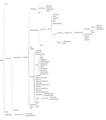
Well, it’s into the details we go!
This week, I have been hitting a LOT of the 90-90 rule. This is the simple principal of the first 90% of the project taking 90% of your allocated time, then the last 10% taking the next 90% of your time 😉
And of course, what better way to run into this rule than with my old arch nemesis…. UI.
When embarking on this current task, I quickly found myself inside a pit of despair. I started to imagine the MAV wiki entries that would be written about the second coming of the dark times. My ears were ringing of memes, Simon and Garfunkel laying down the track to my life story. Just as I was falling into the psychotic pit of trying to get freaking pixel perfect font rendering working for different screen resolutions, a helping hand appeared and plucked me from the clutches of darkness.
It was Rachael. A soothing angel, descending down from the heavens to deliver to me a message from the muse’s above.
“Keep it simple, stupid.”
And with that message, and the force of which it was delivered, I once again rose from my pit of development and grabbed my Photoshop brush and proclaimed…”Okay!”.
Pixels were pushed, inspiration was found, A PLAN was made!

And thus, the Journey of the Final UI was embarked upon.
As they always say, the devil is in the details.

Comments 7
As they always say, the devil is in the details.
#GS ?
Author
Haha, nope, no #gs
Would this just be the main menu UI or would this also include in game’s Head Up Display too?
Author
Everything
Oh god. No, please, PLEASE have someone else do the graphic design. Your UIs are… functional. But they don’t have any panache. No overarching theme.
At least let us see what you’re thinking, and give you inspirations!
Cant wait for UI improvements, gonna bring a new level of feeling to MAV that it definitely needs.
Keep going Cyber we’re with you all the way!
Author
Thank you! The encouragement is greatly appreciated!