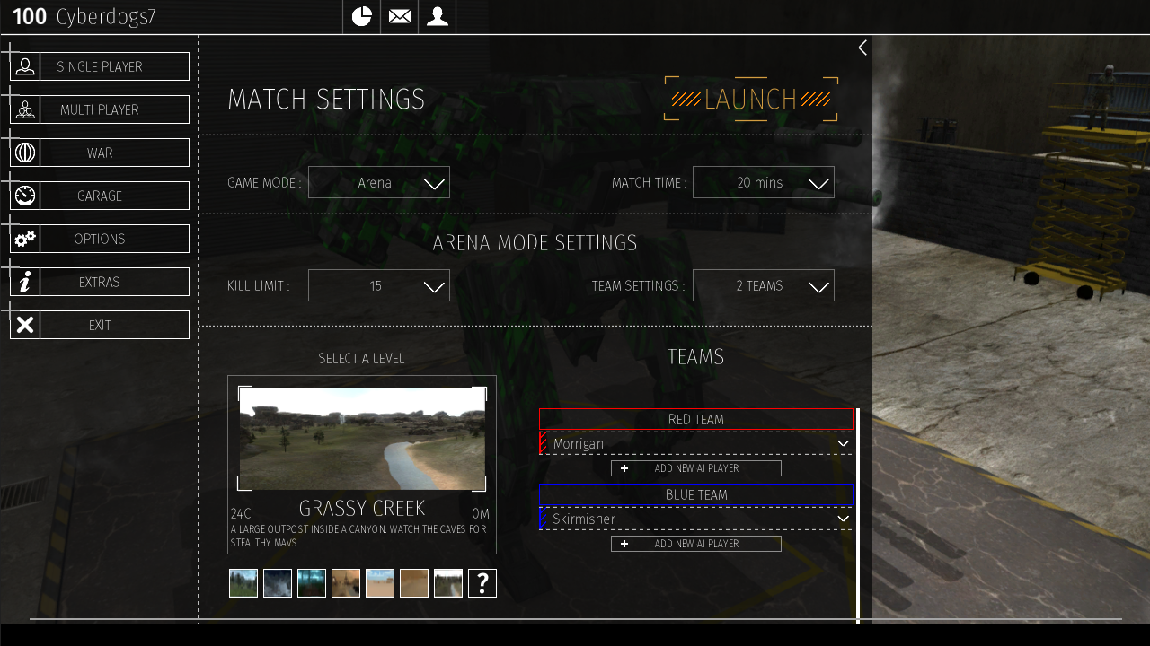
After continuing to work on the UI, I figured it’s time for a bit of a preview!

This should give you a good overview of the style that will be present in the final version.
Functionality wise, it’s greatly improved from the current version. Less clicks to do the same actions, all while better communicating the functionality to the players.
Also, you might take notice that this screen shot is at 720p and not 1080p. This is on purpose to ensure the text and UI is usable at all screen sizes. This version of the UI will be ‘pixel perfect’ and will scale the negative spaces to fill larger screens, instead of scaling the individual elements. This means text that is 14 pixels tall, will ALWAYS be 14 pixels tall, no matter the resolution of the player.
Overall, the progress has been slower than I had wanted, but the result is of a much higher quality. Small bugs get fixed as the pop up and code functionality is being added to achieve the end result instead of contorting the result to match the current functionality.
In other development news, the MAV universe is continuing to expand behind the scenes as stories are getting fleshed out and characters are coming alive. I have actually debated a LOT with how these stories will be released. Some of them will be released as independent blog posts, tagged as story posts, and eventually aggregated into a stand alone story page on the website. Some of these stories, or even parts of the released stories, will be released in other ways. If you were a part of the last story release, you have the tools and resources at your disposal to receive and be a part of these stories. If you do not know what I am talking about with this, I am sure the members of the forums will be happy to answer your questions!
That’s all for this week! Stay tuned for more updates!

Comments 8
mmmm … the long awaited font rework for the seeing impaired …..war option? hmm…. though I do not see the map in the map options that is posted in the pic with a skybox that includes Jupiter… Outpost alpha map rework then? Guess I’ll have to wait through this long dark period and find out…oh how I hate to wait.
As always …Thank you for all that you do.
Author
What map are you talking about? 😉
You should spread those buttons on the top out a bit so they match the other buttons with their margin / padding.
Another neat thing could be some sort of icons for the role-type levels too like maybe cycle the level # and it’s color?
The map picker doesn’t look like it currently supports larger number of maps that we expect to see (junkyard / cavern)
I’m guessing the little downward arrow next to the names will let you set ai settings, would add a button for modifying them though but hey, if it’s more intuitive then it’ll be good.
Jupiter needs to be at least 4x as big. Need to hop on Elite Dangerous and get a good comparison of Jupiter from the surface of Europa because that dev team went crazy with getting their planets and distances right. Haven’t touched that game in ages. Loving that sexy UI though. If you get the dropdown menus to work perfectly as well, it’ll be awesome.
Looking good Cyber!
And the UI looks good too. Can’t wait to give it a spin after my Vacation. So much to look forward too.
I’ve got a setup in Blender that’s size-accurate, maybe I can get some more screenshots from that to use for comparisons.
Also, on the UI- it certainly looks more functional, but is there any plan to up the ‘theme’ of it? Like, this looks more like something you’d see in Spec-Ops than in a mech game. I was expecting more ‘panels of oily metal’ and less ‘Android App store’.
Author
I lot of the design of the UI is to get out of the way and present the information in the best way possible.
While a super ‘tangible’ UI design seems to fit thematically, it ends up dominating over the information trying to be presented by the UI.
Also, while I have gone with a ‘tech limited’ approach to a lot about the MAV’s, it’s hard to say that the amount of tech we have in the present wouldn’t be available in the future. Even tractors have touch screens with nice UI’s in them these days.
Oh dude, just say MAVs are purpose built to withstand cosmic radiation. Ezpz.